Ghent Bailey - UI Design
Monday, July 3, 2017
Wednesday, July 4, 2012
Darksiders - Diablo 2 Clone Inventory Screen
What if Darksiders had been a Diablo 2 clone instead of an M-rated Zelda? (Note: I enjoyed playing the game.) I thought I would work up a UI element fitting with that genre and the Darksiders art-style.
Sunday, June 10, 2012
Pilgrimage Start Screen and Game Select
This is a mockup for the front end of a game in my head. This also contains a little painting I did of the heroine, Puritie. I tried to take a central composition and create some motion and focal points that move the eye. The interaction is a little off of what final would be, so that it can be a bit more web friendly. I used Illustrator, Photoshop and Flash to put this together. Be sure to click the Start Button. Please allow a few seconds to load.


Tuesday, January 10, 2012
Health Bar HUD Animation Test
Wednesday, January 4, 2012
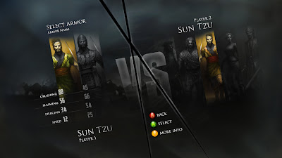
Mortal Kombat Inspired HUD
Thursday, September 2, 2010
User Flow Diagram
Low-Fidelity Wireframes
These are three low-fidelity prototypes I created to demonstrate that I understand the early stages of interface development. These are first draft prototypes and have not received any testing so there are bound to be errors, but that of course is the point of creating them. These were created in Illustrator with a controlled sketchy style which helps everyone evaluating and reviewing them understand that they are proposed designs.
Select Game Screen - See earlier post for a later version >

Lobby Login Screen >

Online Lobby Screen >

Select Game Screen - See earlier post for a later version >

Lobby Login Screen >

Online Lobby Screen >

Saturday, July 10, 2010
Lilypad Pause Menu
I had an idea of water filling up the screen between the game space and the UI elements. I don't think the transition is there yet, but I think once the elements are in place the idea comes across. (The background here is actually a painting created by Tom Scholes, currently at ArenaNet).
Running this .swf in Scaleform solves the dithering problem seen while running this with a browser-based Flash Player.
Still, it needs something...maybe it needs bubbles. Yeah, everyone likes bubbles.

Running this .swf in Scaleform solves the dithering problem seen while running this with a browser-based Flash Player.
Still, it needs something...maybe it needs bubbles. Yeah, everyone likes bubbles.

Warhammer 40K Inspired Design
Subscribe to:
Comments (Atom)


